A guide to the seven styles of Arabic calligraphy

The writing style of Arabic calligraphy, which you may recognise from logos of Arab brands such as Al Jazeera, is a centuries-old art form with a storied history.
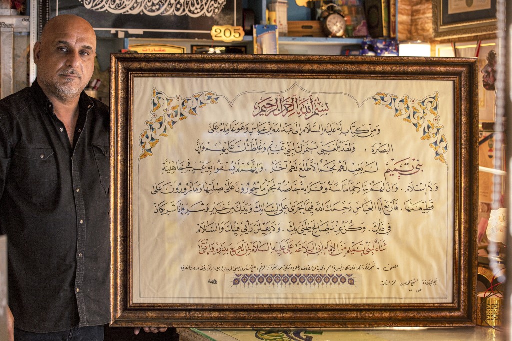
Known for its fluid, curved script, and mostly handwritten using coloured ink on thick card or paper, calligraphy forms a significant part of the cultural heritage of the Middle East, where students spend years learning from elders to master the highly-respected skill.
Originally written on parchment, leather and wood, one of the reasons calligraphy came about was to record and preserve scripts such as the Quran.
As it is believed to convey the harmony and beauty of the spoken word, calligraphy is often also used to pen poetry or powerful passages.
Much of how the script looks is down to the artist's tools. In order to get the sought-after clean, smooth lines, calligraphers learn how to sharpen their pens and prepare their ink.
Traditionally, they used hollow dried reeds cut to a sharp tip, as well as bamboo and other plants.
Over the centuries, Arabic calligraphy, which Unesco placed on its Intangible Cultural Heritage list in 2022, has developed a number of distinct forms.
Styles developed based on local influences and philosophical approaches, making it relatively easy to date the period in which a Quranic manuscript was produced and where it came from.
Here, Middle East Eye explore seven different styles of calligraphy.
1. Kufic
Originating in the southern Iraqi town of Al-Kufa, once a centre of Islamic learning, Kufic script is one of the most famous and abundant styles of Arabic calligraphy.
The script, which developed between the seventh and 10th centuries, can be found engraved on ancient mosques and palaces from Spain to North Africa to Iran, as well as in religious scripture, particularly in early manuscripts of the Quran.
It also started appearing on tombstones, buildings and coins in later centuries.
Kufic is known for its short vertical lines and long horizontal strokes, all in bold typography, with the final product often looking "square" in shape.
The spaced-out style of writing made it relatively easy to read, which was helpful for early converts to Islam wanting to read the Quran. In an era pre-printing press, the task of reproducing the text would have been made easier by the Kufic emphasis on clear, broad, brush strokes.
2. Dewani
This Ottoman style of writing was introduced during the 16th and 17th centuries, and is distinctive for its cursive and flowing style.
Largely used for ornamental and decorative purposes, dewani was developed during the reign of Sultan Suleiman the Magnificent by a designer named Housam Roumi.
During Suleiman's reign, between 1520 and 1566, the script was used for important documents, decrees and legal correspondence.
It remained in official use until the 20th century, and is now used mostly in greeting cards and wedding invitations.
The name of the script comes from the word "diwan", the Ottoman administrative organisation where high ranking officials would meet.
Typically, Dewani was written in black ink or gold paint. The intertwining letters also made it harder to read than other styles.
3. Thuluth
Arabic for "third", the name Thuluth derives from the fact that this style was a third of the size of other scripts used during the Umayyad period.
Requiring knowledge of complex proportions to master, Thuluth text is known for its curved letters and its slightly cursive flow.
This style of typography was rarely used for writing the Quran, and was instead found on manuscripts, tombstones and ceramics.
Notable examples of Thuluth text include the fabric that covers the Kaaba in the Muslim holy city of Mecca.
Thuluth calligraphy is frequently used in art to depict the shape of an animals or human figures.
Due to the spacing of the script and slightly larger typography, it is easier to read in comparison to other styles.
4. Naskh
Naskh, which in Arabic means "to copy", is a rounded and flowing form of calligraphy that is mostly used for transcribing the Quran and other Islamic scripts, as well as literary and cultural manuscripts.
It is easily legible and evidence of its use dates back to the first century after the establishment of Islam.
The style, which is slightly smaller than other forms of calligraphy, allows the writer to move their pen more swiftly and is therefore practical when producing copies of large texts.
The script is believed to have been popularised by the Abbasid calligrapher and minister Ibn Muqla al-Shirazi during the ninth century and was derived from the Kufic script.
Later, Turkish and Arab calligraphers also helped to develop the style.
5. Rayhani
The name Rayhani derives from the plant Rayhan, which means "sweet smelling plant" and is often a reference to myrtle or basil.
This script gets its name from its easily readable, aesthetically pleasing style. It has been used for Quranic text.
Rayhani is said to originate in the Abassid era. Its invention is credited to Ibn As-Sitri, who had spent his career refining earlier calligraphy scripts.
A student of law, he had memorised the entire Quran and reportedly produced 64 copies of it by hand.
Rayhani writing has a pronounced spike on the initial letters of the words, which distinguishes it from other scripts. It has pointier letters than the Naskh style of writing.
6. Muhaqqaq
The term Muhaqqaq in Arabic means "accomplished" or "clear" and was used to describe any distinguished piece of calligraphy.
Due to its legibility, the script was a preferred style for transcribing the Quran, and is considered to be one of the most beautiful forms of Arabic writing among calligraphers.
One of the earliest references to Muhaqqaq writing was found in the Kitab al-Fihrist, a compendium of the knowledge and literature of tenth century Islam, compliled by Idn al-Nadim.
The book has been used as a reference work for medieval and Islamic literature.
7. Riqa
Developed in the late 19th century, this style of calligraphy includes elements of Thuluth, but is more rounded and has shorter horizontal lines.
The word Riqa comes from the Arabic noun Ruqa, meaning a patch or piece of material - a name given to the style because people would use it on small pieces of parchment.
The densely structured style of writing was preferred by Ottoman calligraphers and was further refined by Ottoman designers.
It is notable for having an almost handwriting-like quality while maintaining the elegance and aesthetic qualities of traditional calligraphy.
Today, the style is used in modern graphic design, magazines, and advertisements.
Middle East Eye delivers independent and unrivalled coverage and analysis of the Middle East, North Africa and beyond. To learn more about republishing this content and the associated fees, please fill out this form. More about MEE can be found here.


.jpg)


_0.jpg)


